Windows 10 UWP – Template 10 Mobile Status Bar

Windows-Dev

Template 10 is a set of Visual Studio project templates for Windows 10 XAML / C# apps.

In my previous post I set the app theme to Light and found that the status bar was completely white on Windows 10 Mobile. The status icons were no longer visible.

Before we can make changes to the status bar we first need to add Windows Mobile Extensions for the UWP  to our references:

In the Solution Explorer right click on References and then click Add Reference. In the left pane select Universal Windows and then Extensions from the drop down menu. In the right hand pane select Windows Mobile Extensions for the UWP and click OK.

Now we can customize the status bar by adding the highlighted code to App.xaml.cs.

public override async Task OnStartAsync(StartKind startKind, IActivatedEventArgs args)
        {
            // TODO: add your long-running task here
            await NavigationService.NavigateAsync(typeof(Views.MainPage));
           
            //Set StatusBar background and foreground colors
            if (Windows.Foundation.Metadata.ApiInformation.IsTypePresent("Windows.UI.ViewManagement.StatusBar"))

            {
                var statusBar = StatusBar.GetForCurrentView();
                if (statusBar != null)
                {
                    statusBar.BackgroundOpacity = 1;
                    statusBar.BackgroundColor = Colors.Orange;
                    statusBar.ForegroundColor = Colors.White;
                }

Next just add the required using statements as prompted by Visual Studio.

As you can see I set the background color to orange and the text to white:

uwp-status-bar

Sources:

View at Medium.com

https://stenobot.wordpress.com/2015/07/08/uwp-app-development-styling-the-mobile-status-bar/

https://blogs.msdn.microsoft.com/gianlucb/2015/10/08/uwp-windows-10-app-titlebar-and-status-bar-customization/

Windows 10 UWP – Setting a Light Theme in Template 10

Windows-Dev

Template 10 is a set of Visual Studio project templates for Window 10 XAML / C# apps. By default Template 10 uses the Dark theme.

If you need to switch the Light theme you can add the following code to App.xaml in <common:Bootstrapper:

RequestedTheme="Light"

To see this change in your project, save changes and restart Visual Studio.

Template 10 – Error CS0234 The type or namespace name ‘ApplicationInsights’ does not exist

Windows-Dev

Template 10 is set of Visual Studio templates for Windows 10 UWP C# and XAML applications. For those who are interested there is a whole course about Template 10 on the Microsoft Virtual Academy site.

Once you have installed Template 10 via NuGet you will find that your project fails to build with the following error:

Error CS0234 The type or namespace name ‘ApplicationInsights’ does not exist in the namespace ‘Microsoft’ (are you missing an assembly reference?)

The solution is to add the following references to ApplicationInsights in project.json dependencies:

	"Microsoft.ApplicationInsights.PersistenceChannel": "1.0.0",
	"Microsoft.ApplicationInsights": "1.0.0", 
	"Microsoft.ApplicationInsights.WindowsApps": "1.0.0",

You should then be able to build and run your Template 10 project.

The full project.json is as follows:

{
  "dependencies": {
    "Microsoft.NETCore.UniversalWindowsPlatform": "5.1.0",
	"Microsoft.ApplicationInsights.PersistenceChannel": "1.0.0",
	"Microsoft.ApplicationInsights": "1.0.0", 
	"Microsoft.ApplicationInsights.WindowsApps": "1.0.0", 
    "Microsoft.Xaml.Behaviors.Uwp.Managed": "1.1.0",
    "Newtonsoft.Json": "8.0.3",
    "Template10": "1.1.*"
  },
  "frameworks": {
    "uap10.0": {}
  },
  "runtimes": {
    "win10-arm": {},
    "win10-arm-aot": {},
    "win10-x86": {},
    "win10-x86-aot": {},
    "win10-x64": {},
    "win10-x64-aot": {}
  }
}

SourceStackoverflow

Windows Phone 8.1 Runtime – Forcing Light or Dark Theme

Windows8-Phone-Logo

In Windows Phone 8.1 Runtime apps we can set the theme for the app or for each page.

To set the them for the whole app add the highlighted code to App.xaml:

<Application
    x:Class="LinuxBasics.App"
    xmlns="http://schemas.microsoft.com/winfx/2006/xaml/presentation"
    xmlns:x="http://schemas.microsoft.com/winfx/2006/xaml"
    xmlns:local="using:LinuxBasics"
    RequestedTheme="Dark">

For RequestedTheme you can choose light or dark. To set the theme per page use:

<Page x:Name="page"  RequestedTheme="Dark">

Sources: http://stackoverflow.com/questions/26478465/how-to-force-theme-in-windows-runtime-app

Windows Phone Dev – Disabling the Tilt Animation on a ListView

Windows8-Phone-Logo

I am working on a Windows Phone 8.1 Runtime app and have a ListView to display data on a detail page. The problem is that by default the tilt animation is enabled. This is not wanted because it gives visual feedback to the user that something should happen when the object is tapped.

To disable this behavior we need to create a copy of the default style of the ListView as follows:

Right click on the ListView in the designer and then select: Edit Additional Templates, Edit Generated Item Container (ItemContainerStyle), Edit a Copy…

A copy of the default style will be placed in your XAML.

Find the PointerUpThemeAnimation and PointerDownThemeAnimation Storyboards and remove them (or comment them out if you prefer):

<VisualStateGroup.Transitions>
     <VisualTransition From="Pressed"
                       To="Normal">
         <!--<Storyboard>
             <PointerUpThemeAnimation Storyboard.TargetName="TiltContainer" />
         </Storyboard>-->
       </VisualTransition>
     </VisualStateGroup.Transitions>
     <VisualState x:Name="Normal" />
     <VisualState x:Name="Pressed">
         <!--<Storyboard>
            <PointerDownThemeAnimation Storyboard.TargetName="TiltContainer" />
        </Storyboard>-->
     </VisualState>

Sources: http://www.visuallylocated.com/post/2014/07/09/Disabling-tilt-on-a-ListView-or-GridView.aspx

Windows Phone Dev – Setting Style Properties for ListView

Windows8-Phone-Logo

I wanted to style the background color for my ListView – so first I defined my style (ListViewBorder), in App.xaml:

<Style x:Key="ListViewBorder"
       TargetType="ListViewItem">
       <Setter Property="Template">
           <Setter.Value>
               <ControlTemplate TargetType="ListViewItem">
                   <Border Name="Border"
                           Background="#2c3232">
                       <ContentPresenter />
                   </Border>
               </ControlTemplate>
          </Setter.Value>
      </Setter>
 </Style>

Then I bound my ListViewBorder to the ItemContainerStyle:

<Grid Grid.Row="1"
       x:Name="ContentRoot">
       <ListView x:Name="groupListView"
                 ItemsSource="{Binding AllGroups}"
                 ItemContainerStyle="{StaticResource ListViewBorder}"
                 SelectionChanged="lstGroups_SelectionChanged"
                 ItemTemplate="{StaticResource RecipeGroupDataTemplate}"
                 ContinuumNavigationTransitionInfo.ExitElementContainer="True"
                 Margin="0,10,0,0" />
</Grid>

Here’s the before and after results:

ListViewBlk

Custom ListView color


Sources: http://stackoverflow.com/questions/2816731/how-i-can-add-border-to-listviewitem-listview-in-gridview-mode

Windows Phone Dev – Making the Status Bar blend with your App

Windows8-Phone-Logo

I’m working on a WinRT app for Windows Phone 8.1 and I wanted the app to blend in with the Status Bar more.

For this example I have added the highlighted code to my MainPage.xaml.cs:

        public MainPage()
        {
            this.InitializeComponent();

            this.navigationHelper = new NavigationHelper(this);
            this.navigationHelper.LoadState += navigationHelper_LoadState;

            // Make Status Bar part of the screen

            ApplicationView.GetForCurrentView().
            SetDesiredBoundsMode(ApplicationViewBoundsMode.UseCoreWindow);

        }

In my MainPage.xaml I have simply specified a border background around my first stackpanel:

&lt;!-- TitlePanel --&gt;
        &lt;Border Background=&quot;#0050EF&quot;&gt;
            &lt;StackPanel Grid.Row=&quot;0&quot;
                        Margin=&quot;30,0,0,28&quot;&gt;
                &lt;TextBlock x:Uid=&quot;RegionsPageHeader&quot;
                           FontSize=&quot;32&quot;
                           Text=&quot;index&quot;
                           Margin=&quot;0,40,0,-16&quot;
                           Style=&quot;{StaticResource TitleTextBlockStyle}&quot;
                           SelectionChanged=&quot;TextBlock_SelectionChanged&quot; /&gt;
            &lt;/StackPanel&gt;
        &lt;/Border&gt;

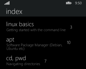
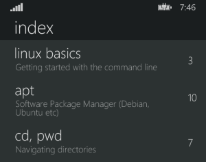
As you can see from the screenshot the Status bar and my textblock now share the same color.

blennd

Sources: http://blogs.msdn.com/b/johnkenn/archive/2014/04/16/hiding-the-status-bar-in-windows-phone-8-1-apps-or-not.aspx

Windows Phone Dev – XAML Background Alignment Grid

Windows8-Phone-Logo

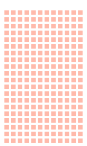
Some projects in Visual Studio have an alignment grid commented out in the MainPage.xaml.

Unfortunately the sample that I am working on did not have this code so I had to go looking for it:

<Image Source="/Assets/AlignmentGrid.png"
       VerticalAlignment="Top"
       Height="800"
       Width="480"
       Margin="-4,-32,0,0"
       Grid.Row="0"
       Grid.RowSpan="2"
       IsHitTestVisible="False" />

This snippet needs to be inside the final </grid> tag on the page to work.

You will also need to put the AlignmentGrid.png in your assets folder.

AlignmentGrid

Don’t forget to delete the .png and comment out (or delete) the code before uploading to the store!

Windows Phone Dev – XAML: Text Wrap and Text Trimming at the same time

Windows8-Phone-Logo

Windows Phone typically uses a large font for headings, and this is great – until you have a lot of text.

By default headings will just run off the side of the screen, which for my app is not optimal. Turning on Text Wrapping is the next step – but that is not a great solution if you suddenly have three lines of very large text.

The solution would appear to be to simply use Text Wrapping and Text Trimming at the same time, but that doesn’t work until you specify the height of the textblock:

<TextBlock x:Name="AppCommand"
                       d:DataContext="{Binding}"
                       Text="{Binding Title}"
                       Margin="0,12,0,0"
                       TextWrapping="Wrap"
                       TextTrimming="CharacterEllipsis"
                       MaxHeight="152"
                       Style="{ThemeResource HeaderTextBlockStyle}" />

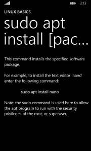
The MaxHeight property is something you will have to play around with depending on your needs, but as you can see I have limited my heading to two lines which is what I wanted to achieve:

aptinstallpackagedetail

Windows Phone Dev – Character Escape Sequences

Windows8-Phone-Logo

I recently stumbled upon a list of c# character escape sequences here.

Escape sequences are needed because certain characters have special meanings within a literal string (and so cannot be used directly). For example, a single quote would need to be written as follows: \'

So I took a quick look at the list to see which ones would be useful working within a basic data-bound Windows Phone app sample.

The following escape sequences all functioned the same (which was expected):

  • \f – Form feed
  • \n – New line
  • \r – Carriage return

I have been in the habit of using \r\n in my apps for a new paragraph, but any combination of the above works.

The double quote escape sequence \" did not work but this special character sequence works fine instead: &quot;

The escape sequence that I liked the most was \t which is used for a horizontal tab. I wish I had known about this one a while back.

The other interesting one is \u for Unicode characters. With this you can, for example, open up Character Map, select any character and enter the four digit hex code for that character. \u00E6 will display a Latin small letter Ae. Very useful!